
|
|
Graphs and charts, therefore, are typically the best way to present volunteer data. Take care, however, that your graphs "fit" your audience and are neither too technical nor too simplistic.
Habitat scores as a percent of reference condition at sites #1 and #2 for 1992-1994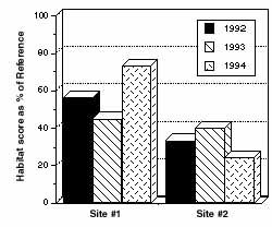 Figure 6.1 Example of a bar graph displaying biological data |
Bar Graph
A bar graph uses columns with heights that represent the value of the data point for the parameter being plotted. Fig. 6.1 is an example using fictional data from Volunteer Creek.
Line Graph
A line graph is constructed by connecting the data points with a line. It can be effectively used for depicting changes over time or space. This type of graph places more emphasis on trends and the relationship among data points and less emphasis on any p articular data point.
Fig. 6.2 is an example of a line graph again using fictional data from Volunteer Creek.
June phosphorus concentrations at Sites #1 and #2 from 1991-1997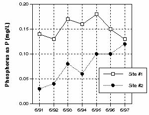 Figure 6.2 Example of a line graph depicting trends in phosphorus data |
Pie charts are used to compare categories within the data set to the whole. The proportion of each category is represented by the size of the wedge. Pie charts are popular due to their simplicity and clarity. (See Fig. 6.3)
Graphing Tips
Regardless of which graphic style you choose, follow these rules to ensure you use them most effectively.
Summary of water quality ratings for Volunteer Creek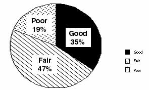 Figure 6.3 Example of a pie chart summarizing water quality ratings |
Textbook statistics commonly assume that if a parameter is measured many times under the same conditions, then the measurement values will be randomly distributed around the average with more values clustering near the average than further away. In this i deal situation, a graph of the frequency of each measure plotted against its magnitude should yield a bell-shaped or normal curve. The mean and the standard deviation determine the height and breadth of this curve, respectively.
The mean is simply the sum of all the measurement values divided by the number of measurements. This statistic is a measure of location and in a normal curve marks the highest point at the center of the bell.
The standard deviation, on the other hand, describes the variability of the data points around the mean. Very similar measurement values will have a small standard deviation while widely scattered data will have a much larger standard deviation.
While both the mean and standard deviation are quite useful in describing stream data, often the actual measures do not fit a normal distribution. Other statistics often come into play to describe the data. Some data are skewed in one direction or the oth er. Other data may have a flattened bell shape.
It is important to note that biological information often does not follow normal, bell-shaped distribution. This is because biological communities are dynamic, complex, and interdependent systems; many factors influence them, and these cannot be statistica lly predicted. For example, bioassessment scores plotted against habitat assessment scores will be at their best when habitat quality is at its best. For data that is non-normally distributed, the mean and the standard deviation are not appropriate summary statistics.
For describing non-normally distributed data, it is best to use statistics that can convey the information for a variety of conditions and which are not overly influenced by the data points at the extremes of the distribution. The median and the interquart ile range are two statistics that are commonly used to describe the central tendency and the spread around the median, respectively. These statistics are derived by placing the data points in order of value from lowest to highest. The median is simply the value that is in the middle of the data set. The interquartile range is the difference between the value at the 75 percent level and the value at the 25 percent level.
The best method for presenting this type of data is called a box and whisker plot. One simple box and whisker plot will graphically display the following information:
|
Box Plot of Total Metric Scores from June, 1995 (No. of sites=52) 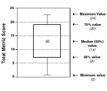 Figure 6.4 Example of a box plot |
Choosing a Map
It is best to have two types of maps. One should be a working map with a lot of detail. The other should be used for display purposes. The working map should include important features such as:
U.S. Geological Survey (USGS) 7.5 minute quads (scale of 1:24,000; 1 in. = 2,000 ft) are available with and without topographic contours (elevation markings). These maps are available for most of the United States.
The USGS maps are particularly useful if your information will be incorporated into a geographic information system (GIS), since many of these systems use the USGS maps as base maps. For your data to be used in a GIS, it is likely that you will have to provide the latitude and longitude of your sample sites, which can be obtained by using the grid markings on the USGS topographic maps. Several different coordinate systems are marked, including standard latitude/longitude and the Universal Transmercator coordinates. For assistance in learning how to use these coordinate markings, talk to the local USGS office or someone in the geography department at a university. It may also be possible for the GIS office you work with you to "digitize" the maps, thus saving you the trouble of trying to calculate the coordinates.
The display map is best used to illustrate your program results at public meetings or in reports. This map should be simpler than the detailed map and show only principal features such as roads, municipal boundaries, and waterways. It should have sufficient detail and scale to show the location of sample sites, and have space for summary information about each of the sample sites. Commercial road atlases and county or town road maps available from state transportation departments are examples of the types of maps that can be used for display purposes (See Fig. 6.5).
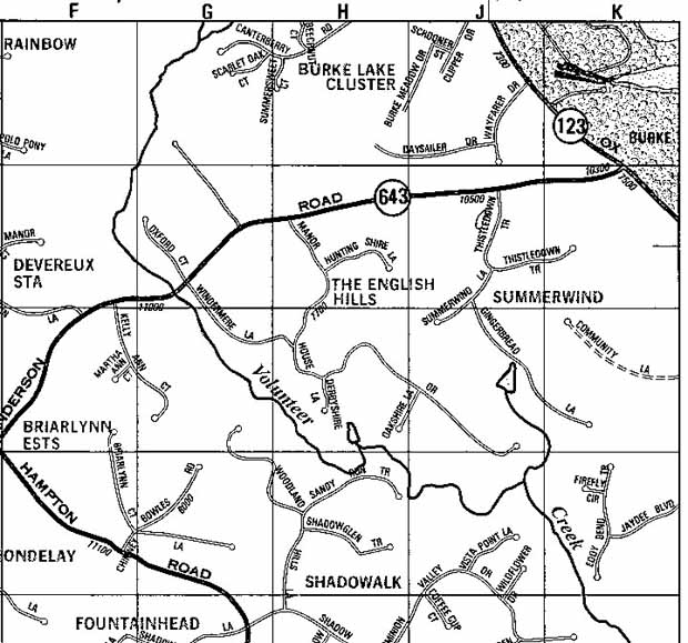
Figure 6.5 |
Some suggestions for using a map to display your data include:
EPA provides a World Wide Web service known as Maps on Demand that allows users to generate maps displaying environmental information for anywhere in the U.S. (except Hawaii, Puerto Rico, and the Virgin Islands). Types of information that can be mapped include EPA-regulated facilities, demographic information, roads, streams, and drinking water sources. Maps of varying scales can be generated on the site (latitude and longitude), zip code, county, and basin levels. Submit your request and email address, and after a brief wait, you will be able to view your map on-line or download it. Maps on Demand can be reached through EPA's Surf Your Watershed homepage at www.epa.gov/surf2/locate/. |
EPA Home | Office of Water | Search | Comments